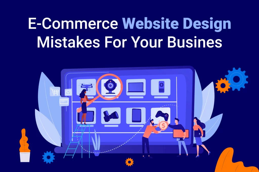
Picture this! You are a startup armed with the perfect website setup: an attractive theme, brand colors, and SEO-friendly content. But despite your efforts, you are not captivating visitors. Why? Your website design might be the culprit. Creating an engaging website isn’t always straightforward.
Many e-commerce business owners, in an attempt to save money or take control, design their websites themselves. However, by 2027, over a quarter of retail sales will be online, emphasizing the importance of a well-designed UI across browsers.
Given this significance, website design mistakes can be costly. In this blog, we will uncover common web design errors made by designers and e-commerce owners and share tips to steer clear of them.
What are the flaws that a good website designer should avoid?
1. Inconsistent designs
2. Inferior image quality
3. Less white space
4. Difficult checkout process
5. Faulty navigation
6. Too many interactive elements
7. Poor mobile/tablet touch target
8. Imbalance between functionality and speed
Inconsistent designs
All the rest of the seven design mistakes stem from this one monster of mistakes, which is lack of consistency. When we say consistency, it encompasses visual identity, copy style, tone of the website, quality of images and the overall UI experience of the website.
What happens to a website with inconsistent designs? Mismatched design elements can cause confusion and make the navigation action difficult. For example, a website using different colors for CTA or different fonts across headings can trick the mind of the user into relearning UI when interacting with your website. This can cause them to leave the website without completing the desired action.
Design inconsistencies elongate the development times as the engineer has to create new components each time instead of using the existing ones. Users cannot be aesthetically pleased with the website’s UI, hence a lower chance of conversions.
Ways to fix design inconsistencies:
- Set predefined rules for color palettes, fonts, and navigation elements.
- Users prefer simplicity, so don’t overcomplicate the design.
- Maintain the same tone of content – formal/conversational.
- Ensure line thickness is consistent for icons and dividers.
Inferior image quality
As per Baymard’s usability testing, 56% of users instantly start exploring product images after entering the website.
According to the same testing, 25% of e-commerce website owners have product images that are inefficient for a user to evaluate the product.
One of the biggest e-commerce web design mistakes is stuffing your website with stock images. This does no good to your brand except hurting it.
Another common mistake is limiting the level of zoom, thereby hampering the interest to view the details of interest. Users are sure to abandon your website at this point.
Ways to fix image quality:
- To push a sale on your website, work on understanding image optimization techniques. Expert web designers believe the ideal e-commerce product image size is 800×800 or 640×640.
- Have a good assortment of product visuals to show off your products from varied angles. Leverage a collage maker to create this.
- If your site doesn’t support multiple high-quality images at once, shoot HQ images for the entire product catalog.
Less white space
Cluttered websites are not just less enticing to the eye but also make your e-commerce business less credible.
Moreover, they increase cognitive load, which makes the users struggle to scan through the visual landscape.
Ways to fix a cluttered website:
- Follow the golden rule of white space, also known as negative space – the free area around the design elements, which helps in maintaining users’ attention.
- Use both micro (space around small elements like text) and macro white spaces (those between different sections of a page) to improve visibility.
- Surround all the CTAs with white space.
- Monitor white spaces in mobile view too.
Difficult checkout process
Nearly 1 in 5 shoppers abandon their carts due to complicated checkouts, according to Baymard data.
If your product page is well designed and has guided the user to add your products to cart, you have to effortlessly route them towards the conversion process.
Ways to fix the difficult checkout process:
- Refrain from using unwanted design elements that deviate your shopper’s attention.
- Ask only for essentials during checkout – name, email, and payment details.
- Have a dynamic design that lets users add or remove products from the checkout page.
Ready to transform your e-commerce website for higher conversions? Discover how our expert design services can optimize your online store for success.
Explore our comprehensive e-commerce design solutions tailored to your business now!
Faulty navigation
Imagine an online store with plenty of categories, but each has one or two products in them. Or, even worse, you’re trying to find a product and the navigation is so messy that you end up abandoning the website.
Too many product categories or too less would certainly do the harm user experience and make you lose a credible customer.
Ways to fix faulty navigation:
- Pen down your categories before you put the products in the online catalog.
- Ensure every category has a handful of products in it, else group similar categories.
- Make the UI seamless for shoppers to navigate through each category.
Too many interactive elements
Web designers are creative, sure. But, adding too many interactive elements only confuses the users and steers their attention away.
With too many features being uploaded online, designers are curious to try them to stand out. However, it requires careful planning and rigorous testing.
Ways to fix interactive elements:
- Try not to include multiple fields in a menu. Users shouldn’t be forced to perform many clicks when a few would suffice.
- Label all the icons you use on your website.
- Keep the navigation menu simple and concise. Ensure they are accessible on any screen size.
- Add only those interactive elements that don’t alter the style of your website.
- Use minimal animated elements like hover-triggered popups, 3D effects and dynamic scrolling to help users get a great feel of the website.
Poor mobile and tablet touch target
Have you ever touched on a wrong icon on your smartphone and had to wait till eternity till the wrong window loads? That’s because web designers unfortunately forget that users come with varied finger sizes and the design elements should be created accordingly.
Ways to fix touch targets:
- The average width of an adult finger is around 1.6 to 2 cm. So, create finger-friendly targets accordingly.
- Give enough room for the users to hit the right target. So, the touch targets should be designed 45 to 55 pixels wide.
Imbalance between functionality and speed
From design to development, balancing loading speed and functionality is a challenge. Appealing animations, videos bring more users but drastically reduce the site’s loading speed, which ultimately lowers your search engine rankings.
So, it’s essential to strike a balance, especially for e-commerce sites that showcase a wide range of products.
Moreover, lately e-commerce sites are also including live chat, display ads, heatmaps etc, which surely impact the loading speed.
Ways to fix loading speed:
- Keep simplicity as the main goal before you start designing your website. Use only select videos that are sure to increase the conversion rate.
- Be choosy when it comes to incorporating third-party tools and do it early on in the design process.
- Set a limit for the amount of content each page has.
- Employ conditional loading to only allow essential elements to appear on mobile versions.
- Make it easy for web crawlers to understand your website by using clean code.
- Use fast hosting.
Conclusion
From start to finish, website design is a journey filled with challenges. Balancing functionality with site speed, SEO with user experience, and branding with sales elements is an art.
For e-commerce owners, customer delight should be the priority, while web designers strive to craft aesthetic interfaces. Keep these lessons in mind to create polished designs that resonate with your audience.
Here’s a pro tip for e-commerce business owners: Leverage Wow!CX’s customer-centric approach. We specialize in theme customization, logo design, and interactive UI, ensuring your website is responsive across all devices, and catering to a broad audience.
Discover how to skyrocket your e-commerce conversions by avoiding these 8 design mistakes!
Click here to optimize your website now.